If you’ve ever wondered why some YouTube videos explode with views while others fade into the feed — even with great content — the answer often lies in one word: thumbnail.
In 2025, the competition on YouTube is fiercer than ever. Every minute, over 500 hours of content are uploaded. Viewers scroll lightning-fast, deciding in less than 0.3 seconds whether to click or skip. That’s not much time to make a first impression.
A thumbnail is your video’s handshake, your billboard, and your first hook. It’s what convinces someone to stop, stare, and click.
So, how do you create a thumbnail that gets clicks in 2025 — not just looks nice?
Direct answer:
To make YouTube thumbnails that get clicks in 2025, focus on fast visual clarity, emotional impact, and strong contrast, while testing different versions to see what resonates with your audience.
In this in-depth guide, you’ll learn every practical and creative trick to design thumbnails that stand out — backed by facts, psychology, and real YouTube performance insights.

The Science Behind Clickable Thumbnails
Before diving into design, let’s understand the science of what makes people click.
1. The 0.3-Second Rule
Modern viewers make subconscious decisions extremely fast. Research shows that online users form visual judgments in just 0.3 seconds — especially on mobile, where screens are small and distractions are huge.
That means your thumbnail must be instantly legible, clear, and emotionally charged. If it takes effort to understand, it’s already too late.
2. The Power of Visual Storytelling
A thumbnail that tells a mini-story — a reaction, transformation, or conflict — naturally triggers curiosity. Humans are hardwired to seek resolution. If your image hints at a “before and after” or a “mystery,” you create a mental gap that only a click can close.
3. The Role of Emotional Faces
According to YouTube’s internal studies, thumbnails featuring expressive human faces can increase click-through rate (CTR) by 20–30%. Emotions like shock, laughter, excitement, or curiosity capture attention and communicate your video’s vibe instantly.
Key Principles for 2025
Let’s break down the most important design principles that define successful thumbnails this year.
1. Quick Decision Clarity
Your thumbnail should be crystal clear within 0.3 seconds — especially on smartphones.
Tips for clarity:
- Use a single main subject (face, object, or logo).
- Keep text minimal — 2–5 words max.
- Maintain high contrast between text and background.
- Avoid cluttered elements or tiny icons.
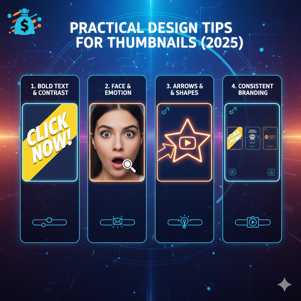
2. High Contrast & Bold Typography
Contrast makes your thumbnail pop against YouTube’s white or dark background.
How to use contrast effectively:
- Combine bright, saturated colors (like yellow, red, or cyan) with dark backgrounds.
- Use bold, sans-serif fonts — like Montserrat, Impact, or Anton.
- Add drop shadows or outlines to text for better legibility.
- Test light text on dark background vs dark text on bright background.
3. Faces and Emotion
People connect with people. If your video involves you or someone else, use an expressive face.
Why faces work:
- They create instant emotional engagement.
- Facial expressions convey tone faster than text.
- Eyes often guide viewers’ focus toward the title or object in the frame.
Best practices:
- Crop tightly — focus on the face, not the background.
- Show a clear expression (shock, excitement, frustration, etc.).
- Avoid filters that hide emotions or over-edit skin tones.
4. Simple, Focused Composition
In 2025, simplicity wins. The top-performing thumbnails usually include only 2–3 visual anchors.
Keep it simple by:
- Highlighting your main subject clearly.
- Using negative space to make elements stand out.
- Removing background clutter using blur or overlays.
- Following the Rule of Thirds to guide the eye naturally.
5. Relevant and Compelling Imagery
A good thumbnail tells viewers exactly what to expect.
A great thumbnail makes them curious.
Tips for relevance:
- Match the visual directly to your video’s topic.
- Avoid clickbait — it kills retention.
- Use imagery that hints at transformation, discovery, or “aha” moments.
- Add visual metaphors — like a lightbulb for ideas or a graph for growth.
6. Consistent Branding
Brand consistency builds recognition and trust. If viewers recognize your thumbnails instantly, they’re more likely to click again.
How to create consistent branding:
- Use a signature color scheme (e.g., yellow & black).
- Keep the same font family across thumbnails.
- Include subtle branding elements like your logo or a border.
- Maintain a similar layout (e.g., face on the left, text on the right).
7. Text Optimization
Less text = more clarity.
Golden rules for text:
- Limit to 2–5 words max.
- Use action words like “Secret,” “How To,” “Vs,” or “Shocking.”
- Place text in high-contrast areas, ideally near the center or bottom third.
- Ensure it’s legible even at 120 pixels wide (mobile feed size).
8. Visual Hooks and Storytelling
The best thumbnails tell a mini-story that begs for context.
For example:
- “Before & After” transformation images.
- Two contrasting objects (“Old vs New,” “Cheap vs Expensive”).
- Reaction thumbnails showing surprise or confusion.
- Split-screen layouts to show comparison or conflict.

Practical Design Tips for 2025
Now that you know the principles, let’s get practical.
1. Ideal Resolution and Safe Areas
- Recommended size: 1920×1080 (16:9 ratio).
- File size: Under 2 MB.
- Format: JPEG or PNG.
- Safe zone: Keep essential elements inside 1380x768px — so they’re not cut off on smaller screens or TV previews.
2. Smart Composition Rules
Use the Rule of Thirds — divide your frame into a 3×3 grid and position key elements along the lines or intersections.
Other composition ideas:
- Use leading lines (e.g., pointing hands or arrows).
- Make the subject’s eyes face the text.
- Place your main object slightly off-center to add visual interest.
3. Color Psychology in Thumbnails
Color isn’t just decoration — it’s psychology.
| Color | Emotion/Effect | Best For |
|---|---|---|
| Red | Urgency, excitement | Reactions, gaming |
| Yellow | Energy, positivity | Tutorials, lifestyle |
| Blue | Trust, calmness | Tech, finance |
| Green | Growth, success | Education, nature |
| Purple | Creativity, luxury | Art, fashion |
| Black/White | Simplicity, focus | Minimalist or cinematic content |
4. Text Legibility Tips
Your text should be clear, bold, and easy to read even on mobile.
Do:
✔ Use bold, sans-serif fonts.
✔ Add subtle drop shadows or outlines.
✔ Use contrast overlays behind text if the background is bright.
Don’t:
❌ Use cursive or script fonts.
❌ Place text over busy backgrounds.
❌ Use more than two font styles per thumbnail.
5. Consistency in Design Elements
When you use similar outlines, borders, or filters, viewers subconsciously connect your videos as part of one brand.
Examples of consistent elements:
- White outline around subjects.
- Subtle border with brand color.
- Slight texture overlay for depth.
Testing and Optimization
Even the best designers don’t get it perfect the first time. The secret is testing.
1. A/B Testing Thumbnails
YouTube now allows limited A/B testing (rolling out gradually), but you can also test manually.
Method:
- Upload two or three variations of your thumbnail.
- Run each for 24–72 hours.
- Measure which one achieves the highest CTR (Click-Through Rate).
🧠 Pro Tip: Aim for a CTR between 5%–10% for average performance, and above 10% for strong results.
2. Track CTR and Watch Time
High CTR doesn’t always mean success.
If people click but leave within seconds, your thumbnail might be misleading.
Use YouTube Analytics to check:
- CTR (how many clicked).
- Average view duration (how long they stayed).
- Impressions vs. views (how often YouTube recommends your content).
Refine thumbnails to match viewer expectations.
3. Analyze Successful Peers
Study thumbnails from top creators in your niche.
Observe:
- Their color schemes.
- Facial expressions used.
- Text styles and placement.
- Lighting and emotion in images.
Don’t copy — adapt. Create your own recognizable pattern inspired by what works.
4. Use Quick-Win Templates
Templates save time and maintain consistency.
Create templates like:
- Face + Bold Text on Dark Background
- Split-Screen Comparison
- Object Highlight + Reaction
Use them as starting points, then tweak colors or text for each video.

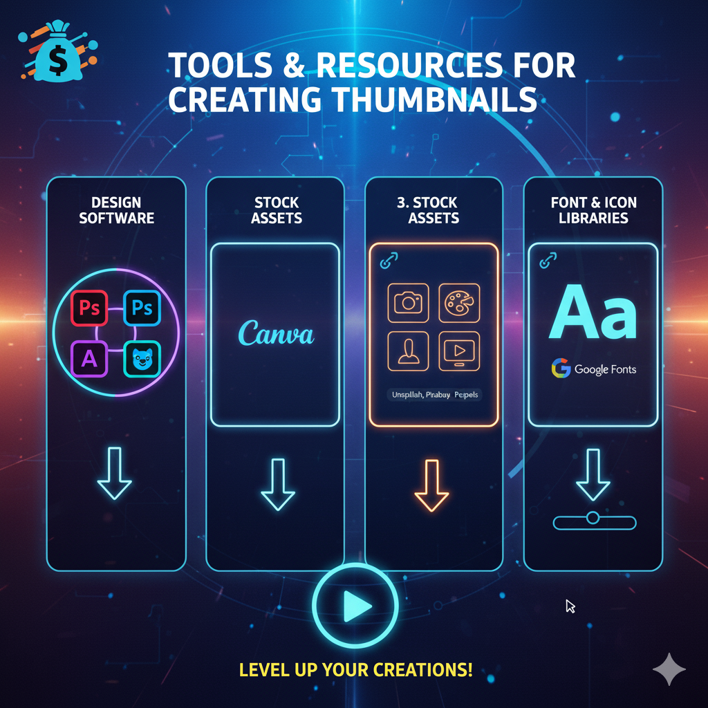
Tools and Resources for Creating Thumbnails
You don’t need to be a Photoshop pro to make great thumbnails. There are powerful tools available in 2025 that make it easy and fast.
1. Design Tools
- Canva Pro: User-friendly with pre-made YouTube thumbnail templates.
- Adobe Express: Lightweight, cloud-based design with AI-powered suggestions.
- Photopea: Free, browser-based Photoshop alternative.
- Figma: Ideal for teams or creators managing multiple designs.
🧠 Tip: Always export thumbnails at 2x or 4x resolution for sharpness, then scale down before uploading.
2. Font Selection
Stick to 2 font families:
- One for main title (bold, attention-grabbing).
- One for secondary emphasis (clean and readable).
Popular choices:
- Anton
- Impact
- Bebas Neue
- Poppins Extra Bold
3. Color Palettes and Branding Kits
Keep a small palette:
🎨 2–3 main colors + 1 neutral tone.
Use tools like:
- Coolors.co – for color palette generation.
- Adobe Color Wheel – for complementary schemes.
🧠 Example:
If your brand uses blue and white, introduce one accent color like orange for highlights.
Common Pitfalls to Avoid
Even experienced YouTubers make mistakes with thumbnails. Here are the big ones to dodge:
❌ 1. Overly Busy Designs
Too many elements confuse the viewer. Keep it minimal.
If everything is important, nothing stands out.
❌ 2. Misleading Visuals
Clickbait thumbnails might boost initial clicks but kill retention and trust.
Always ensure your thumbnail matches the actual content.
❌ 3. Tiny or Illegible Text
If viewers can’t read your text on mobile, it’s wasted space. Test your thumbnail at 10% zoom before publishing.
❌ 4. Poor Color Choices
Avoid clashing or dull color combinations. Low saturation looks washed out and fails to attract attention.
❌ 5. Relying Only on AI-Generated Thumbnails
AI tools can help, but they can’t fully understand emotional context or narrative.
Always review and customize them to ensure intent and clarity.

Expert Tips for Higher CTR in 2025
Here are advanced strategies top creators use:
🔹 Use Emotion and Context Together
Pair expressive faces with contextual backgrounds — like a graph, explosion, or mystery object.
🔹 Keep Thumbnails Fresh
Update old thumbnails on evergreen videos to reboost CTR.
🔹 Align Title & Thumbnail
Your thumbnail and title should feel like two parts of one sentence.
🔹 Think Mobile-First
Over 70% of YouTube views now come from mobile devices. Design for small screens first.
🔹 Add Subtle Depth
Use gradient overlays or drop shadows to separate subject and background.
How to Develop Your Unique Thumbnail Style
The most successful YouTubers — like MrBeast, Marques Brownlee, or Ali Abdaal — all have instantly recognizable thumbnail styles.
To build your own:
- Pick a consistent color palette.
- Use recurring layout patterns.
- Maintain consistent tone (fun, professional, educational, etc.).
- Create a style guide in Canva or Photoshop to replicate easily.
🧠 Pro Tip: Branding consistency can increase recognition and CTR by up to 40% according to TubeBuddy analysis.
The Future of YouTube Thumbnails
YouTube’s design trends are evolving. Here’s what to expect going forward:
1. AI Thumbnail Suggestions
YouTube is testing AI tools that auto-generate thumbnails from video highlights. But creators who customize these AI outputs will still perform best.
2. Dynamic Thumbnails
Coming soon: adaptive thumbnails that change based on viewer behavior or region.
3. Minimalism on the Rise
Trends are shifting from flashy clutter to simple, focused designs with subtle gradients.
4. Cinematic and Realistic Looks
Soft lighting, depth of field, and photo-realistic compositions are becoming standard in high-end channels.
Conclusion: Your Thumbnail Is Your Video’s First Impression
In 2025, making clickable YouTube thumbnails isn’t just about being creative — it’s about being clear, strategic, and emotionally smart.
Here’s your quick recap:
✅ Keep it simple and bold.
✅ Focus on faces, contrast, and storytelling.
✅ Design for clarity within 0.3 seconds.
✅ Stay consistent with branding.
✅ Test and refine continuously.
When you master these elements, your thumbnails won’t just get clicks — they’ll build recognition, trust, and long-term growth for your channel.
So next time you upload a video, remember: your content deserves attention.
Make your thumbnail earn it.
